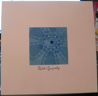
A very simple card for "Less is More" this week, following their sketch (below) I masked my card and sponged the center panel in a medium blue ink. I then stamped my hero arts stamp off-center, using a darker blue ink. And then re-inked only the center of the stamp to give the slight effect that its fading from darker to lighter towards the edges... it didn't work *perfectly* but I was pretty pleased with it. I then stamped the stampin' up sentiment in the same dark blue ink and added a dark blue gem to the middle of the stamped flower.
This is the sketch I used.


Very nicely done - very LIM :)
ReplyDeleteLovely card!
ReplyDeleteLovely card, looks great in blue
ReplyDeleteJo x
wshat a great card Kerry - love the colours.
ReplyDeleteThis is a lovely effect Kerry, super shades of blue!
ReplyDeleteThanks so much
Chrissie
"Less is More"
Well I think it pretty much did work perfectly! I love it and it makes a brilliant sympathy card in blue.
ReplyDeleteGorgeous! Jo x
ReplyDelete